


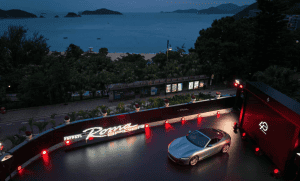


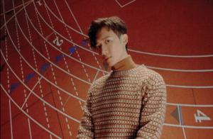
Tumi opened its first flagship in Asia along the stylish byways of Tokyo’s Omotesando Hills. Using over 250 alumninum blades, the store is an ode to the brand’s signature 19 Degree collection and an impressive architectural project. Victor Sanz and artist Michael Murphy speaks to Zaneta Cheng about designing the space and what it means for the lifestyle brand

There’s a new addition to the sleek, cutting-edge architectural facades along Tokyo’s Omotesando Hills. Famously home to many international brand boutiques, the thoroughfare has long had a reputation for being an architectural showcase for brands and their flagships. Tumi has just joined these prestigious ranks with a flagship store where towering blades of silver form the standalone one-story building’s façade. The undulating surface mimics the brand’s signature 19 Degree aluminum collection and is yet another step in the lifestyle brand’s continued efforts to innovate and evolve for their customer. It’s also somewhat of a homecoming for the luggage and lifestyle brand. Japan was the first market the brand opened in the Asia Pacific region over two decades ago. With aluminum blades standing at 20 feet, conceived and built in only 10 months, this flagship is also in anticipation of the brand’s 50th anniversary in 2025.

For creative director Victor Sanz, who’s held the role since 2016, marrying function with aesthetic has been one of the hallmarks of his tenure. “We’ve found that parallel path where want to say that you don’t have to sacrifice fashion for function. You should never sacrifice that. Like why should you have to make the choice between ‘oh, if the product looks good then it’s not going to work the way I need it to,’ or ‘hey it has everything I want that suits my life, but it’s not quite meeting the aesthetic side.’ So I look at aesthetics just as important as function because if you’re feeling confident, and if the product aligns and reflects who you are, you’re performing better,” Sanz says.
When the opportunity to house the brand’s first standalone flagship store in the Asia Pacific region, Sanz knew that he wanted to integrate this fundamental design code into both the façade and interiors of the space. For inspiration, the creative director looked to their 19 Degree collection because “when we first started designing the 19 Degree collection, we wanted it to be at the crossroads of design and engineering, of functionality and art. We wanted to create something that was engineered but looked like it was almost hand-sculpted,” Sanz tells us. “So when you look at the aluminum and you see how it’s flowing, it has an essence of water. Or sometimes I’ll describe it as what wind would look like if you could kind of create it in physicality. So with this becoming one of our design codes within the ecosystem, we wanted to take this and expand it not only from travel, but then also to day-to-day bags, and lifestyle. The question then was how do we evolve this into something that we can bring to the façade of a space without making it look rigid?”

The resulting 250 aluminum fins and interior pillars that bear the contours of the 19 Degree collection make for a clean, contemporary, avant-garde space. “We wanted to figure out how to design something that looks fluid, that looks very light so you can actually see into the store but that would continue to evolve and shift as you move around the space so you can see the ridge shift and change and capture light like it does on the case itself,” Sanz says, holding up his own Tumi 19 Degree Aluminum Backpack, which looks remarkably like a jetpack and is functional, easy to use and stay upright on its own. Even in the dimmer surroundings of the Cerulean Tower Hotel bar, the silver backpack catches the light along its waved ridges. “These were the elements that we brought in and to layer on top of that, it was also not only having the façade of a store but how you bring this element inside so that when you enter the space, you can see all of the columns carrying through with this 19 Degree design language and you can actually go up and touch and feel the actual aluminum pieces. We also wanted to bring the idea of art into it and we worked with artist Michael Murphy to create this sculptural element at the centre of the store so now you’re experiencing an architectural moment, a brand moment and an artistic moment all in one.”

The piece at the centre of the store riffs off of the series of blades used inside and outside the store. Forming a T shape, the piece looks different depending on where the observer stands. “I’ve developed my own way of communicating with objects. The work I make is like a language I use to speak and communicate with people and create experiences that they might be able to have when they interact with the artwork. So when Tumi came to me, it was more about how I would communicate the essence of Tumi and what they’re about in the language that I use,” says Murphy, whose piece Sanz describes as multidimensional and fluid. The piece is an unexpected element in the store but speaks to the two pillars bearing the waves of 19 Degrees that frame it in the store. The collaboration process between brand and artist was easy. Murphy, who’s created work for the brand before describes the brand as a family. Which is true. A few days spent with the team based in headquarters quickly inducts you into the close-knit family-style culture the brand has managed to retain.
“Sometimes it’s just business but for these guys, it’s like I got brought into this family and in getting to know more about them and their products, it was really important for me that the piece doesn’t feel like an alien spaceship that landed in the middle of the store because that’s what happens sometimes with artwork. I wanted it to be something that reacted to the space and felt like it was a part of everything around it so I was given a 3D model of the actual store build and I created the piece as a reaction to the materials, to the aesthetic and the interior and exterior of the space. The façade of the building is all these blades that swim around and so the art is also a bunch of blades that are suspended in the centre. It’s a bit different but speaks the same language.”

At the end of the day, Sanz wants to be able to communicate through the store, the brand’s commitment to evolution. “I think over the years as we started developing these design codes, and as the brand direction evolves and the organization moves with it together, we all understood that this flagship was going to be a one of a kind moment for the brand. That allowed us a lot of freedom to really start pushing ourselves beyond just the standardized store that we have, which is our new concept that’s rolling out globally but saying how do we take that concept, define it and really amplify the beauty of what we’re tyring to say – that we’re no longer just the brand about functionality and durability, we going beyond that. It’s about customers, as they walk into the store, to feel that what they’re seeing in the store is the same level of attention that we put into the product. They understand it as the brand, but here, they can see and feel the innovation that’s pushing us forward.”
Also see:


