


“What you don’t know is that that sweater is not just blue, it’s not turquoise, it’s not lapis, it’s actually cerulean.”
One of the most iconic monologues from The Devil Wears Prada, delivered by Miranda Priestly, is far more than a sharp power play—it’s a defining lesson for Andy (and the audience) that in fashion, “color” is never just color. What appears ordinary often carries layers of meaning, history, and cultural influence far beyond what meets the eye.
#legend_TH invites you to explore five shades that may seem simple at first glance—but hold far richer stories beneath the surface.
Cerulean Blue
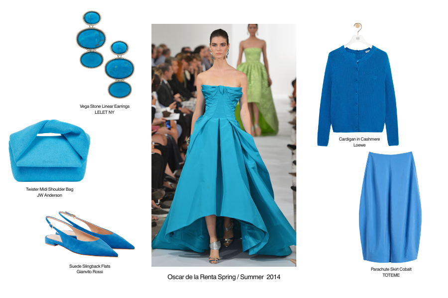
We begin with Cerulean Blue, a shade whose name derives from the Latin caeruleus, meaning sky or sea. In 1999, Pantone named it the very first “Color of the Year” for 2000, marking the dawn of a new millennium with a tone that symbolizes calm, confidence, and optimism in an increasingly digital age.
By 2002, the color surged across runways, championed by houses like Oscar de la Renta and Yves Saint Laurent. What followed was a classic trickle-down effect—from haute couture to mass market—mirroring the very fashion cycle Miranda Priestly once dissected so precisely.
Chartreuse Green
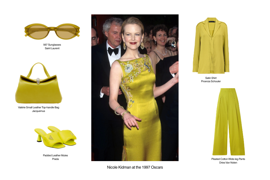
Chartreuse Green is a vivid yellow-green that feels equally electrifying and enigmatic. Its name originates from a herbal liqueur crafted by the Carthusian Order in France, made from over 130 botanicals, resulting in its signature luminous hue.
With its “so-ugly-it’s-chic” appeal, this shade has become a signature for designers like Dries Van Noten and Miuccia Prada. One unforgettable moment? Nicole Kidman in a chartreuse gown at the 1997 Oscars, designed by John Galliano for Dior—a look that redefined red carpet daring.
Tyrian Purple
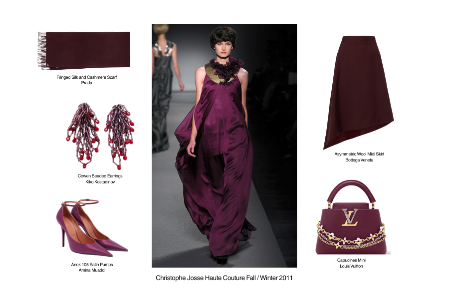
If any shade could be crowned the “royalty of colors,” it would be Tyrian Purple. This historic dye was extracted from the mucus of sea snails by the Phoenicians—requiring up to 12,000 shells to produce just 1.5 grams.
Its labor-intensive process and pungent production made it extraordinarily rare and expensive, reserved exclusively for emperors and elites. Though modern versions are synthetic, luxury houses still embrace Tyrian Purple to evoke opulence, authority, and a sense of mystique rooted in antiquity.
Poppy Red
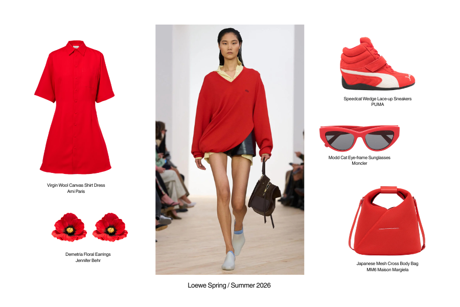
Few reds carry emotional weight like Poppy Red. Following World War I, red poppies became a global symbol of remembrance, as they were among the first flowers to bloom across war-torn fields.
In art, Impressionists like Claude Monet used poppy red to punctuate landscapes with vibrancy and contrast. In fashion, it’s often considered a “universal red”—balanced between warm and cool undertones—making it flattering across skin tones while radiating both playfulness and allure.
Aureolin Yellow
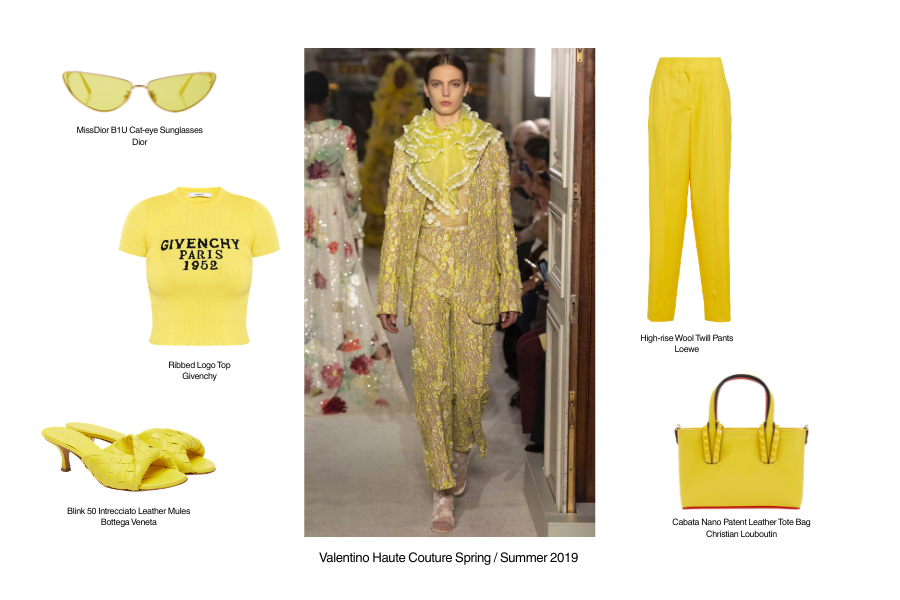
Also known as Cobalt Yellow, Aureolin Yellow was first synthesized in 1848 by a German chemist, during a time when most yellow pigments faded easily. Its breakthrough lay in its transparency—allowing layered applications to create soft, luminous depth reminiscent of natural sunlight.
Once prized and reserved for master artists, Aureolin carries a quiet richness and warmth. In fashion, it lends itself beautifully to clean tailoring or textured fabrics, elevating garments with a refined, sophisticated glow that transcends the simplicity of ordinary yellow.