


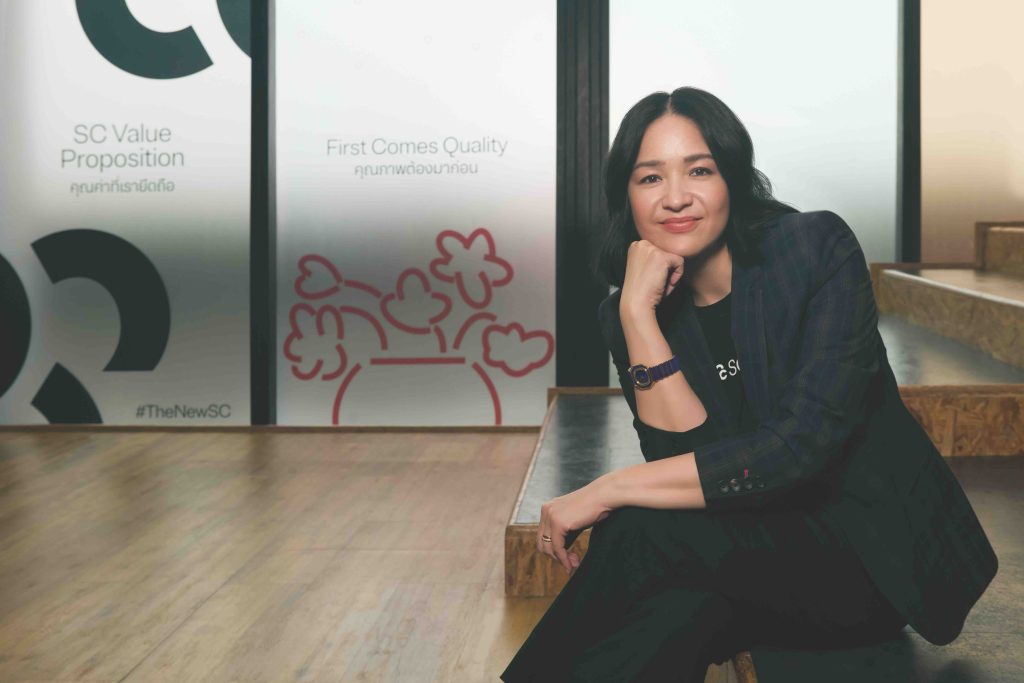
The moment SC Asset unveiled its new logo; it prompted a wave of questions. Not merely because it looks different, but because it feels unfamiliar in a way that invites curiosity, what story is the brand about to tell next? After more than two decades as a recognisable property developer, this shift appears to go beyond aesthetics. It signals something more profound.
#Legend_th sat down with Chomchada ‘June’ Kuldiloke, Head of Corporate Brand & Communications at SC Asset, to explore the origins of the change, the thinking behind the new logo, and what lies ahead.
#legend_th: What sparked this rebranding initiative?
CK: People have known us as SC Asset since the company was founded and listed on the stock exchange, roughly 23 to 24 years under our original wordmark. However, following COVID-19, consumer behaviour changed significantly, both in how people live and how they use their homes. There was a period when condominiums struggled, as people felt uneasy about shared spaces, while houses saw strong demand. As the pandemic eased, condominiums regained momentum. Yet one thing had clearly changed is the way they live. Previously, home was where you returned after work. During COVID, many discovered they could work remotely. Some became content creators, generating income from home. Homes evolved into offices, gyms, and multi-functional living spaces. As developers, we had to adapt. It became evident that simply “build and sell” would no longer be enough.
#legend_th: How did this shift reshape your business structure?
CK: We began to view our business as two engines: development for sale, which has always been our core, and development for rental, which we already had through our office building portfolio. We then considered what grows alongside cities, tourism and logistics stood out. Over the past two years, we’ve expanded into both, with particularly strong growth in hospitality and logistics. More recently, we’ve begun developing the third engine, focused on future quality of life.
#legend_th: What role will wellness play going forward?
CK: We want to build on what we already do well, caring for our residents, and extend that into long-term life care, supported by technology.
Today, life is more complex, and every household faces different challenges. If we can create solutions tailored to real-life situations, we can genuinely enhance quality of life.

#legend_th: With multiple business engines, what remains unchanged?
CK: Across everything we do, we share three core values. First, we never compromise on quality. Second, we genuinely care, we think on behalf of our customers. Third, responsibility. We believe mistakes are inevitable. What matters is how you respond, do you walk away, or stand by your customer until the issue is resolved? For us, we never walk away.
#legend_th: What was the key driver behind the rebrand?
CK: The idea came from our CEO, Nuttaphong ‘Pong’ Kunakornwong, who has consistently driven transformation within the organisation. He didn’t want people to see us and think we are only about “assets”. That perception has been built over time, and if we want to change it, we must change how we present ourselves, which led to this rebrand.
#legend_th: What is the enduring core of the brand?
CK: Our philosophy is “For Good Mornings,” creating better mornings for everyone. We believe that when people wake up without worry, they have the energy to pursue what matters in life. Our role is to take care of the home, removing one layer of concern. This hasn’t changed; it has simply expanded. From customers, employees, and partners, we now think more broadly about society as a whole.

#legend_th: How is this philosophy expressed in the new brand?
CK: Through the idea of “creating value for people and the planet”. It reflects our intention not to be confined to property development, but to do anything that creates meaningful value for people.
#legend_th: How did the logo design process begin?
CK: For us, a logo must not only be beautiful, but timeless. We began by deeply understanding our brand identity. We then chose to work with Pentagram, a London-based design firm and one of the world’s most established design consultancies, to bring an international perspective beyond a purely Thai context. They travelled to Thailand to truly understand how people live. We showed them what we do, our homes, our after-sales services, and the experience we want people to feel when they encounter our brand.
#legend_th: Why Pentagram?
CK: We considered several firms across Asia and Europe, both large and small. During presentations, we felt Pentagram understood the Asian context in a way that aligned with what we needed. It wasn’t that others weren’t good, it was about the right balance between international perspective and local understanding.
#legend_th: What did work with a global team bring to the brand?
CK: It broadened our perspective. We may think in a certain way as Thais, but external voices challenge assumptions. They helped translate who we are into a design language that communicates globally.
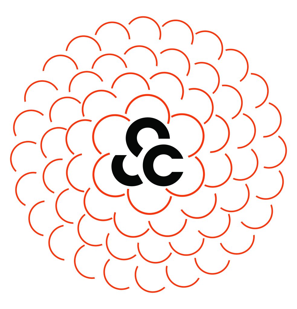
#legend_th: What inspired the new logo?
CK: One key inspiration is the sunflower. It reflects our approach to customer care, our customers are like the sun, and we are the sunflower that continually turns towards them. This idea forms what we call the “Sunflower Mindset”, representing care, attentiveness, and growth alongside our customers at every stage. Pentagram took the internal structure of a sunflower, organic and non-linear, and developed it into a design that represents limitless possibilities.
#legend_th: How was this translated into the final design?
CK: The team used the sunflower’s structure to create a logo made up of three unequal circular forms. When arranged, they can expand infinitely and can also be read as “SC”, aligning with our belief that business should have no limits.
#legend_th: What does the logo communicate today?
CK: It’s not a logo that states something outright and ends there. It invites interpretation and conversation, it can be a flower, SC, or a form that keeps evolving. We like that it sparks conversation and curiosity.
#legend_th: What about the expanded colour palette?
CK: Previously, orange was our primary colour. Now, we’ve introduced a broader palette, including pink tones inspired by the morning sun within the same spectrum. We also use other tones, black, grey, and more, depending on context. It reflects a brand that is more diverse and open.
#legend_th: How would you like people to perceive the brand today?
CK: We want people to feel confident in us, whatever we do, they trust us and want to move forward with us. The logo may not define us explicitly, but it creates space for interpretation. For us, that’s the power of branding. It’s not about changing who we are, it’s about expanding what we believe, making it clearer and more far-reaching than ever before.