Pierre Charpin ranks as one of the boldface names in the world of design, with his works having caught the attention of prominent museums including the Centre Pompidou and Musée des Arts Décoratifs, as well as quintessential French luxury house Hermès. He talks to Stephenie Gee about his Cadence collection in collaboration with Saint-Louis and creating crystals for everyday use
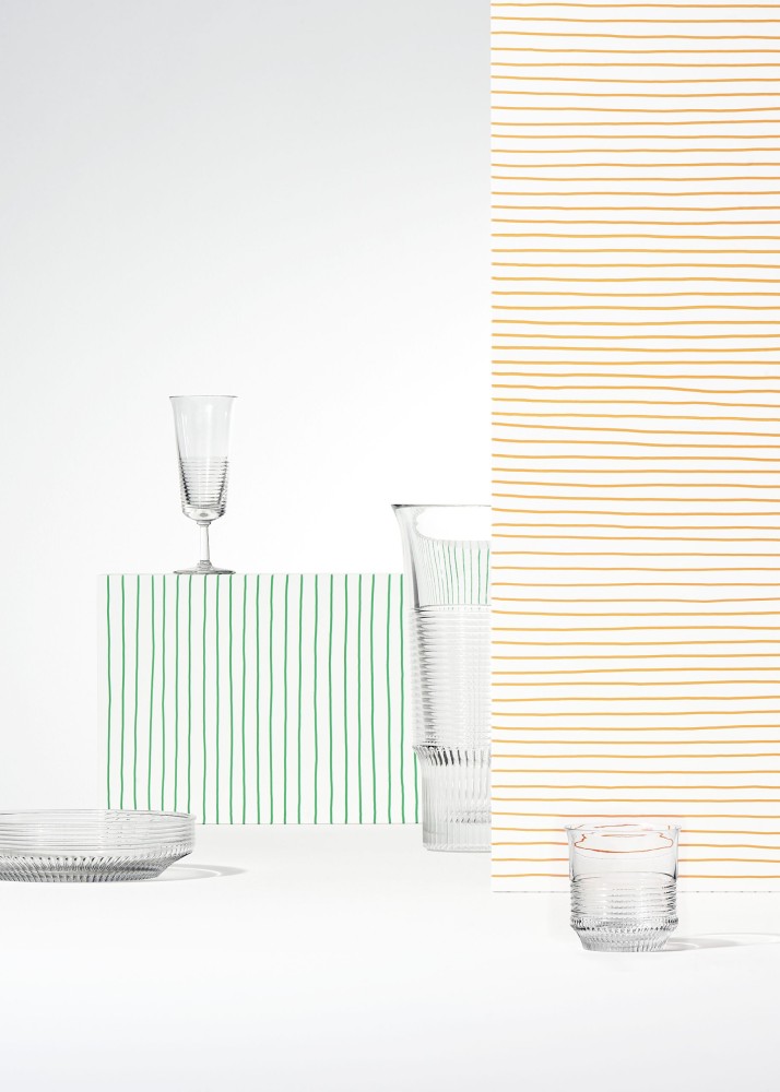
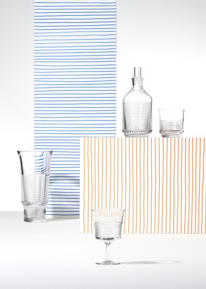
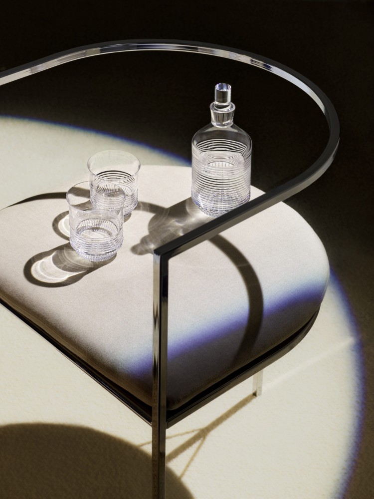
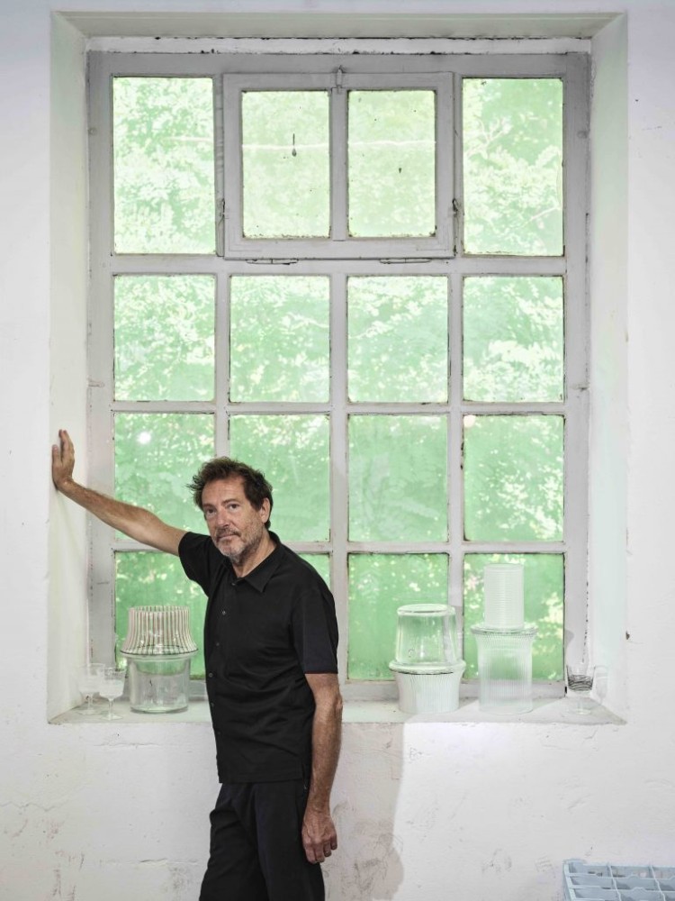
A good design shouldn’t only carry the mark of its creator, but also the time in which they live. And in a time of incredible complexity, which brings with it profound stress and anxiety, comes the desire to hunker down and get back to the basics. Cadence, a 29-piece homeware collection created by renowned French designer Pierre Charpin and haute cristallerie Saint-Louis, reflects this new style of life by way of clear crystal objects from wine glasses and fruit bowls to decanters and light fixtures.
When it comes to making crystal – typically a more formal material representative of class and quality – casual, the keywords are functionality and simplicity. The clear-cut lines of Charpin’s design, which came to be the unifying element of the collection after a trial-and-error process that confirmed its malleability to adapt to different shapes and sizes, highlight the geometry of each silhouette. Vertical lines are etched into the lower parts to elevate the forms, while horizontal lines adorn the upper parts of each piece.
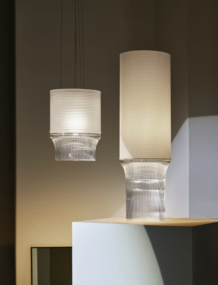
And while Charpin is known for his bright, bold colour choices, Cadence’s purposeful absence of colour serves as a testament to the emphasis on simplicity. But more so, it was to retain “the immaterial transparency of crystal – its purity, its light – through cutting and using paper as lampshades, both acting as screens. By screening crystal’s diffraction, power, we create a new tension, a new poetry.
“It was clear from the start that each of these pieces had to be designed with simplicity in mind to create readable shapes and to design the most archetypal forms possible,” Charpin says. “This was an inevitable response to the intention to offer pieces that are more accessible, easier to use and void of pretension.”
Born in Saint-Mandé, Paris, to a family of creatives – his mother was a weaver; his father, an artist and teacher, who founded the design department of Saint-Etienne Higher School of Art and Design – Charpin is known for ideas that usually take precedence over materials. Yet with Saint-Louis, the material, the crystal and the manufacturer’s existence was a presence impossible to ignore.
“I had the physical craft of glassmaking in mind and the artisans’ gestures and artistry,” he says. Where the horizontal and vertical lines meet on the objects not only marks the joining of the base and body, but also echoes the know-how of Saint-Louis’s artisans – classed as “living national treasures” or Meilleurs Ouvriers de France. This know-how has been passed down from one generation to the next since 1586: the hot workshop where crystal blowers work and shape the molten crystal, and the cold workshop where the pieces are hand-cut and embellished by cutters, engravers and decorators.
“But above all, I was thinking of the landscape shaped by crystal: the town of Saint-Louis [-les-Bitche] and the lives around it. There’s a certain rigour, even a fervour attached. I had this pleasant feeling of usefulness, creating pieces that would nurture and expand the manufacturer’s diverse savoir-faire.”
Also see: Eight of the rarest dinosaurs unveiled in Hong Kong
Cadence marks the third time you’ve collaborated with the French cristallerie, following your 2010 reinterpretation of their signature decanter and the Intervalle collection in 2011. What are some of the things you’ve learned from your past two collaborations with Saint-Louis?
During my first visit to the factory to truly mark the beginning of this new project, I couldn’t imagine missing out on a trip to the attic – an essential ritual for anyone starting a collaboration with the cristallerie. The attic of a wing far away from the production workshops, this space hasn’t been decorated or turned into a museum. It’s inaccessible to the public, slightly dusty and poorly lit, furnished only with large tables that seem to disappear beneath the cacophony of crystal pieces they bear.
This is an abundant, wild and varied archive, a journey through time and an understanding of the history of the cristallerie all the way back to its royal origins. What is most striking and somewhat overwhelming when wandering through this assortment is the immense variety of forms (some borrowed), techniques (both current and forgotten), colours and embellishments, to the point that it’s difficult to get a precise idea of the factory’s specialisation, though cutting is a technique which runs through it all.
Eventually, what emerges is that over time the factory’s production has become gradually more specific and specialised, both in technique and also standardised shape-to-size ratios, both of which give Saint-Louis its current image. Or, at least, the image I had of Saint-Louis crystal before I started designing with them. Without a doubt, my goal with this collection was to affirm what Saint-Louis crystal is known for, while also making it more accessible to the present, rather than changing it altogether.
What would be an overarching theme, aesthetic or approach to all your work and designs?
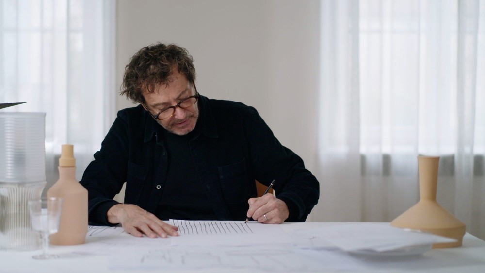
I draw a lot, always by hand, and I throw away a lot! It is through this process that I discover the malleable principle of each of my projects. I like to find an idea and then expand upon it, work in series, whether for pieces intended for Galerie Kreo or just when drawing for drawing’s sake. And for Saint-Louis, I found this very simple principle of horizontal lines meeting vertical lines. This geometry works on objects as diverse as tableware and lighting.
What were some of the challenges you encountered during the design process and how did you overcome them?
The specifications were very precise with a list of objects to be drawn: stemmed glass, goblet, carafe, vase, lamps… Therefore, I decided to design “a glass that is as glass as possible”, or very legible, archetypal forms. The idea of Saint-Louis crystal must also be noticeable at first glance, and so to play on transparency and clarity was not so simple. Also, after the first sketches, certain pieces and their lines posed manufacturing problems and there was a problem with the layout of the lines. So I had to change the lines a bit and that improved the drawing.
What would you say to people who purchase the collection – what can they look forward to?
They are making an excellent choice. They’re adopting a modern vision of crystal, a collection of accessible objects that ring true, in tune with today, designed for everyday use.
How would you describe your design philosophy or style?
I wouldn’t say I have a so-called design philosophy or style, but to me, it is the design approach that speaks for the finished product. Cadence is a collection that emphasises achieving balance through the material, production process and variety of finished products. Throughout the creative process, I want to interpret the pieces in drawings as close as possible to the final products.
Do you have any other collaborations coming up? Or any personal projects you’re planning to pursue?
I wonder and doubt the direction to give to my work, especially against a backdrop of crisis, pandemic, war and violence. What does it mean to design today? How do you do it? For what and with whom?
I taught at the Ecole des Beaux-Arts in Reims from 1998 to 2008 then at ECAL in Lausanne from 2006 to 2015, where I approached students with questions of form and language. I wonder today about what we offer them as a model of design. Everything is properly drawn today, but without a utopian or even critical dimension. What kind of society do we want? What things should we continue to produce? How do we do it well? All these questions and issues for humans and the planet remain unresolved. I am not equipped to answer them. I recognise that fact and this is one of the reasons why I stopped teaching.
Also see: Interview: Japanese artist Yukimasa Ida dominates abstraction and realism


