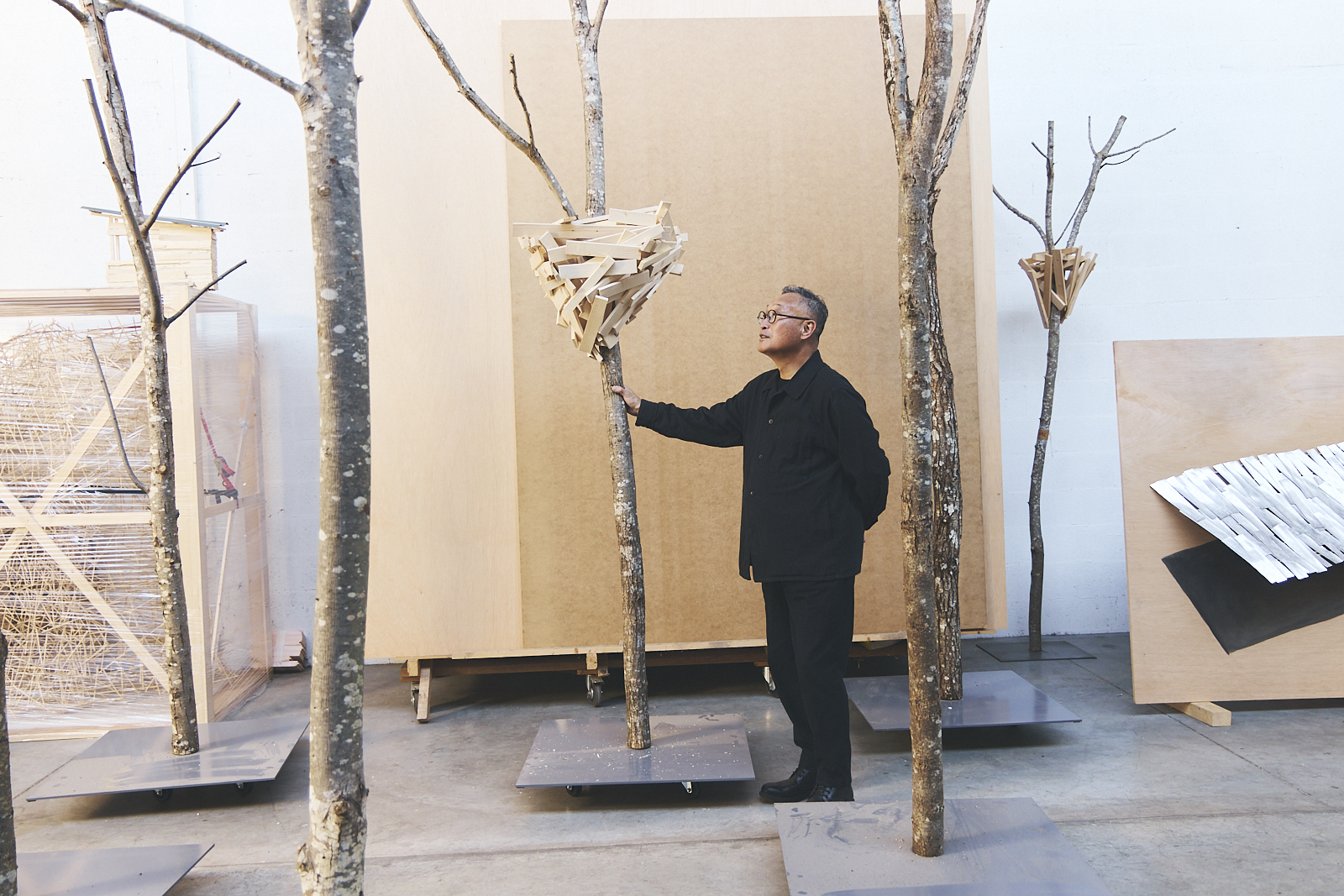

The latest artisan featured in Jaeger-LeCoultre’s Made of Makers programme, Alex Trochut, the grandson of celebrated typographer Joan Trochut, talks to Stephenie Gee about designing a boldly contemporary new alphabet for the Swiss Maison

We are all, coming out of this pandemic, looking for new ways of working while at the same time seeking a different dimension to enliven our work. Swiss luxury watch and clock manufacturer Jaeger-LeCoultre has found both by way of Barcelona-born and Brooklyn-based artist and typographer Alex Trochut, whose emotionally resonant works – which have appeared on album covers for Katy Perry and The Rolling Stones, among others – harness the visual potential of language.
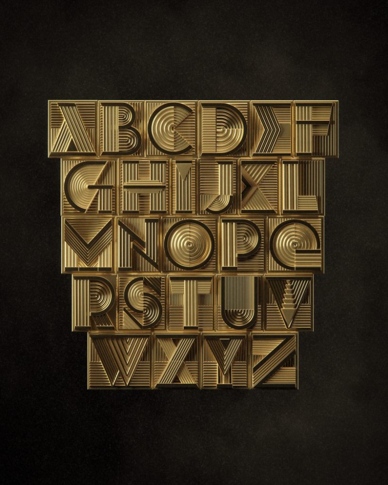
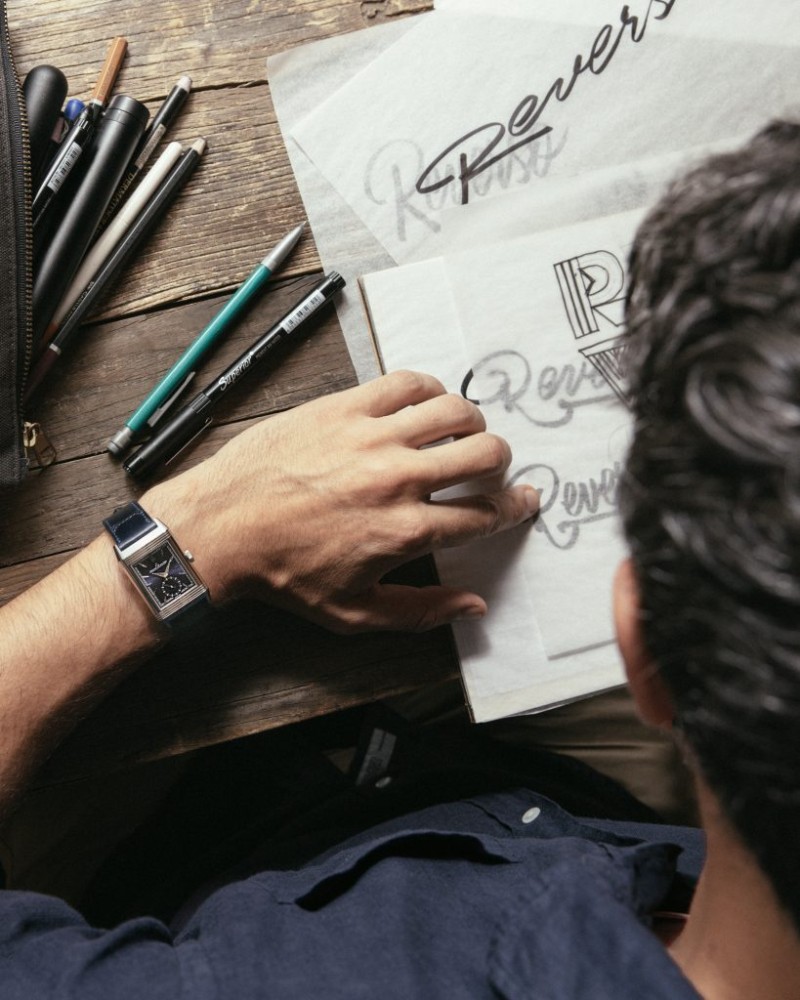
As part of the brand’s Made of Makers programme that celebrates the brand’s spirit of making and creating products of high value, as well as others doing the same in their own industry, Trochut translated the intrinsic values of the maison – “progressive, optimistic and forward-thinking, with a fascination for technology, and tremendous creative energy” – into a boldly contemporary new alphabet style inspired by Art Deco. The distinctive 20th-century decorative art style, which is steeped in the visual landscape of Trochut’s current home of New York, is one of great significance to Jaeger-LeCoultre as the origin of their most timeless invention, Reverso.
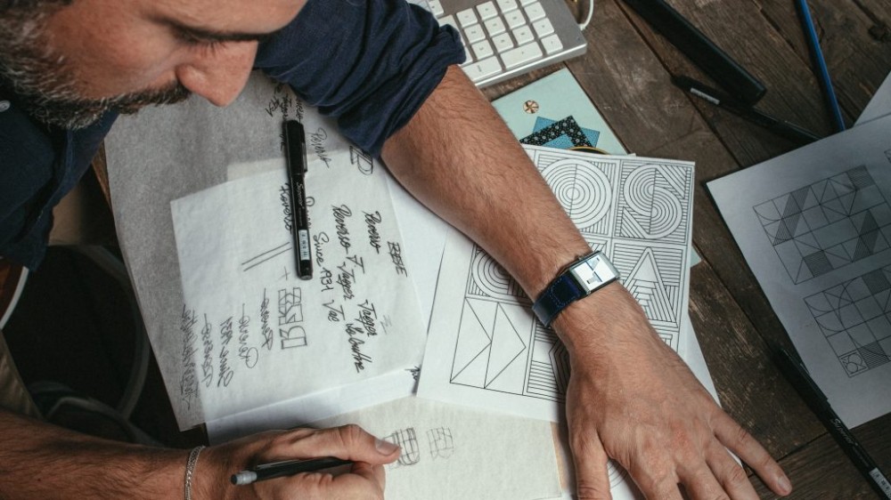
A project that took at least a year and a half to complete (much to Trochut’s thrill – “Good things take time. Things weren’t rushed; it was, ‘It’s going to be done when it’s good’”), the partnership was borne from the artist’s desire to heighten his craft. “I hadn’t worked with a client in a luxury field like JLC before, so it was a really great opportunity for me to bring my work to a much more elevated state,” he tells me via Zoom. “I really looked forward to this collaboration because it’s the first time I can see my work created in a context that is meant to achieve a very high quality in terms of perception, look and style.”
A mix of “emotional and rational decisions with a big internal logic that ties all the decisions into one alphabet or lettering form like a puzzle” letters, according to Trochut, are a means of painting a portrait of a brand. “Every time you work with character design, you need to embody the personality. And with JLC, there were certain traits that were very necessary,” says the artist. “There was this idea of thinking about the past in a very forward way. It had to connect with something that is undeniably part of history, but it needs to feel fresh too. I think that was the connection that we wanted to establish with this collaboration. Like, ‘I understand where this comes from, but I also love where it’s going.’ It needs to be a bit unpredictable but in a good way – this is what we are aiming to achieve.”
How did you begin? Where did your inspiration come from?
I created a mood board, which is kind of like the map of a journey that you are about to go on. You’re thinking, “I want to go to this place,” so you prepare an itinerary through styles. And these styles were Art Deco. The foundation was that timeless, geometric and ornate Art Deco style, and it was about how we could give these elements a bit of a pop or shake. From there, it was a thousand different possibilities.
When creating your mood board, what were some of the other styles that came up, and why did you decide to settle on Art Deco?
Reverso is a watch created, I think, in 1931, and so the watch itself has so many qualities that we can extract from. It was a bit of deconstruction, looking at the watch and looking at the materials – from the leather of the band to the metal to the little elements inside the watch to the flipping element. So there was a bit of information that could be extracted from here and there that created that experience of inter-activity with the watch itself when you have it in your hand. That was a bit of what I wanted to recreate in the form of a message with letters as the hero element. And the letters become the main focus to express the message that is Reverso. It’s kind of like you see it, and you read it, and it becomes a unified action.
What were some of the challenges you encountered along the way?
It was more like an internal battle to get things to the place I was happy with. JLC was a great partner because we clicked on the same things. It was a shared goal, and they were giving me the right conditions to create in that sense. I had freedom but, at the same time, supported around what would be a good way to work, and they helped me to develop things till I was happy with it. They would come to me with all these new ideas that I had never thought of, like, “What about we take this and we transform it into these other production elements?” and “How about we make a physical transformation towards this?” It was a very organic way of creating.
Art Deco is already an established style, so how did you take it and manipulate it to make it yours?
That’s true. Art Deco will never be out of trend, but I think it will always have limitless interpretations because the foundation of it is timeless, geometric and elegant. As opposed to Art Nouveau – where nature is very present, in the sense that it uses a lot of abstract ornamentation, but it also references a lot of natural elements that are very recognisable – with Art Deco, things are just way more redacted to more elemental structures, they’re more elegant and abstract. So that’s why it has just limitless amounts of interpretation. Especially when you get to work with technology that allows you to recreate physical hyperreal materials.
You can play, for example, with putting velvet and metal together, and it creates a sense of furniture almost, or a space or something that feels comfortable. It has all these sensorial elements beyond communication that also make you feel. That was a bit of the idea – creating this readable text but at the same time, we want to feel invited to a space or something that is physically contextualised into a reality that you can invent. That was the goal – to create not just a letter design, which is just black and white, normally. This was way more about trying to embody the letters into becoming objects.
Also see: Design your own Royal Oak to win a trip to Audemars Piguet HQ
What would be something you want people to see or feel when looking at this alphabet?
I think the alphabet is just a tool that, in conjunction with the object, creates a whole. I think the alphabet by itself could be put in different places, and it will create the idea that it’s based around Art Deco. But I think when it really shines is when it’s applied to the watch because it creates that connection. The alphabet just by itself doesn’t work that much. I mean, it does work of course, but when it really becomes a nice conjunction is when it’s with the watch.
So the alphabet complements the watch in the same way the watch complements the alphabet?
Exactly.
As a designer, you feel the potential of the language as a visual medium, and make seeing and reading the same action. How did you blend the two together?
Letters are very flexible matter. All letters have been created by humans so they’re constantly evolving. There are of course rules and composition, the same as fashion or music, but they’re changing all the time and so are letters. Letters are also attached to moments of history and places in time, and I think you can put a lot of elements that belong to something different into the structure of a letter. That’s what I do most of the time, trying to bring something that doesn’t belong to typography and mixing it into letters. So the message, you can read it, but also you have these secondary elements of the visual aspect that you just perceive and therefore you create this unified action.
And how do you balance being expressive with readability and form?
That’s a good question. If you push the expressivity too much, you lose something that is essential for design, which is communication. If you stop communicating, then it’s a slippery slope towards a place where your design needs to be reaching the audience that you are trying to connect with. If you lose that element of readability, it’s a failed design in that sense. But, if you make it so readable that you don’t express yourself, then I feel like you are getting into this territory of less is less, and it’s the opposite of what I think is a fun design. While it’s extremely functional, I don’t enjoy it that much. It’s like a tailored suit. I prefer not to do prêt-à-porter for everybody, I prefer to design custom clothes and be more expressive. But only maybe for one use, one brand or one person, rather than just creating a system that everybody could use, like an alphabet. That’s why lettering is more custom than typography.