
Go graceful, not gaudy
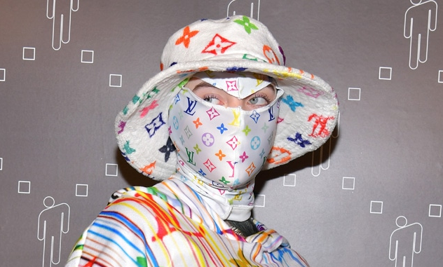
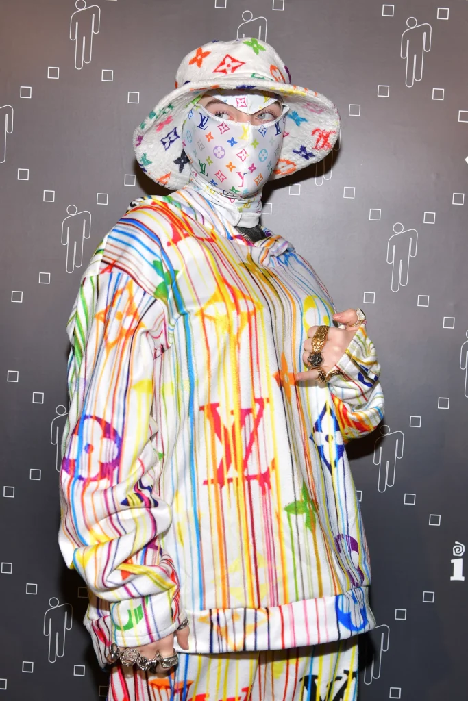
We’ve all seen it before: that one person who covers themselves in branding, letters across the body, head-to-toe in the alphabet. A glance at any Hong Kong street – or possibly, in the mirror – reveals at least one of these not-so-rare characters.
Regardless of the symbol or your personal opinion on it – whether it be Louis Vuitton, Gucci or Chanel – it’s undeniable that logo-allover is harsh on the eyes. Screaming wealth but no taste, it’s certainly not what you want to communicate with your appearance.
That isn’t to say that they have no place in the wardrobe. Depending on how it’s presented, it contributes a subtle touch of texture to an outfit. In monochrome outfits, a small burst of personality. In campier looks, it can pile on to flashy excess. That being said, there’s a way to do it properly. To avoid being as Yohji Yamamoto puts it, “a fashion victim”, we put together a step-by-step guide to styling monograms.
Step 1: Is it ugly?
A pretty obvious point to think over before you buy and/or wear any item, you should ask yourself whether the piece in question is truly appealing. A big reason why logomania appears so extravagantly garish is that much of the time, the clothing itself is either difficult to style or plain and simple, ugly.
As such, take some time to consider whether the piece fits into your current wardrobe. Don’t be blinded by the dazzling iconography or price tag: things like palette saturation size of the graphics and general aesthetic quality come first.
Step 2: Balance out the colors
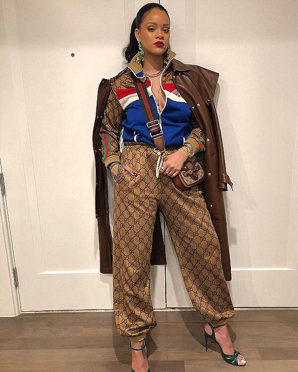
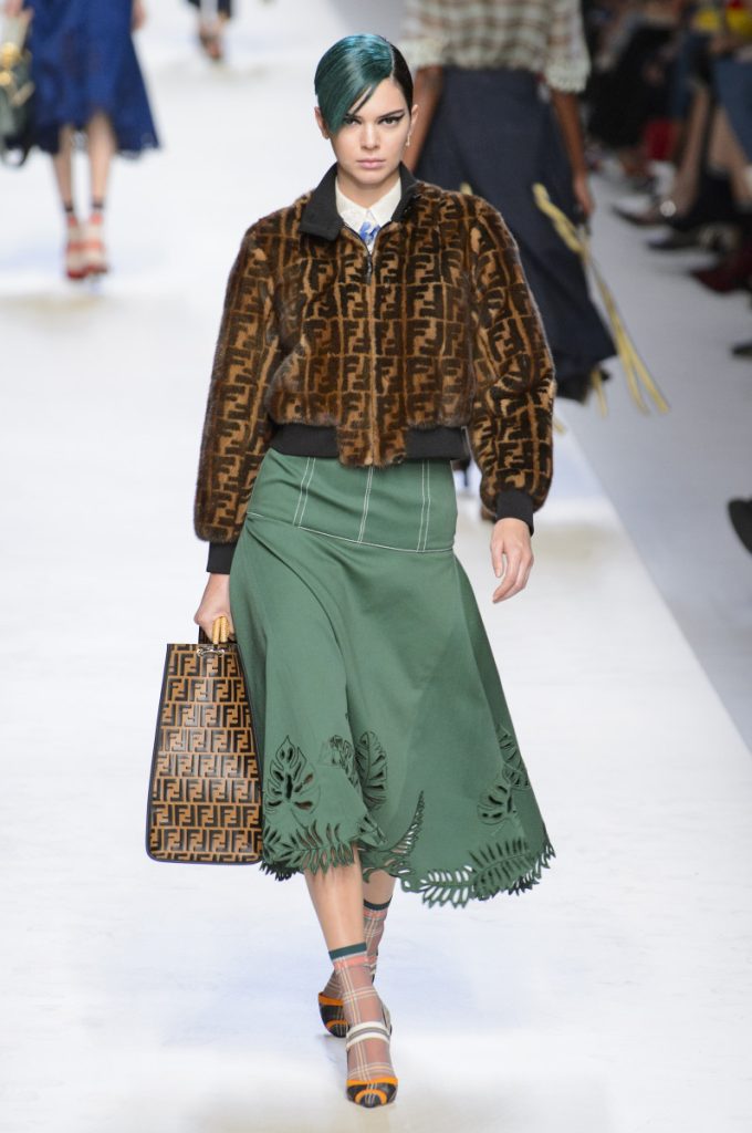
Now that you’ve bought the (hopefully) good-looking item, the key to making it really work is in color. Fortunately, most luxury monograms are relatively neutral in hue, in some variation of brown, yellow and white. For these, they go best as small accessories in belts, scarves and jewelry. Juxtaposed against a minimalist silhouette and warmer shades, it’s an understated addition in class and detail.
For louder colors, larger pieces can be a bold statement. Oversized shapes in t-shirt or pants against vividly contrasting accessories are a flamboyant, albeit more challenging look to pull off.
Step 3: Don’t combine them
This should come as no surprise, but you don’t want to repeat the same pattern on every piece at-risk of your outfit becoming flat and boring. Neither should you be wearing different monograms together – it’s a surefire method to appear ridiculously amateur.
These designs work best as small embellishments or a sole centerpiece for an outfit. Mixing them together dilutes their power in both aspects.
Step 4: Remember what makes an outfit look good
Although more difficult to style than other elements – and some logos prove trickier to style than others (Gosha Rubchinskiy or Comme des Garçons, for instance, tend to feel subtler and less eye-catching than the bold, distinctive Goyard pattern) – a truly bad outfit usually stems from a combination of multiple missteps. Keep this in mind, and the other three steps will flow naturally.
See also: The classic bags that are making their comeback