


When a German Artist and a French Maker of Champagne Share a Love of Transformation

Feb 08, 2017
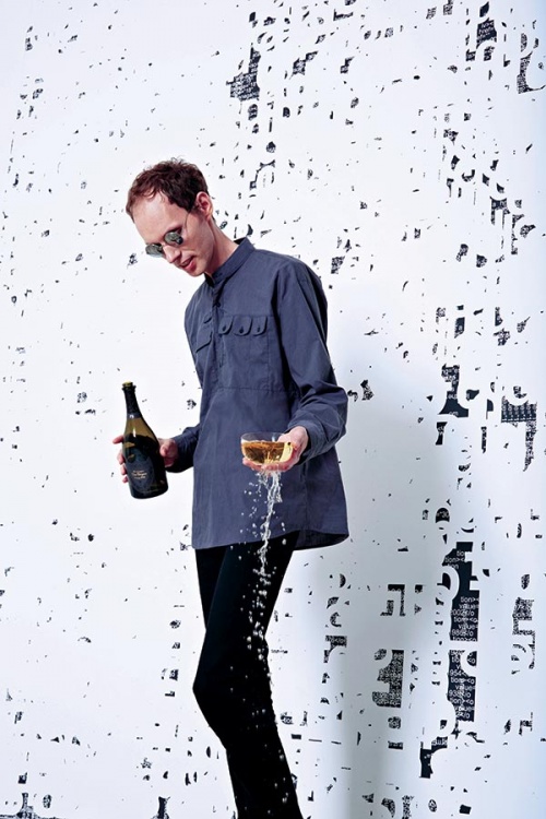
The Dom Pérignon champagne house often aligns itself with governors of the world’s tastes. Iris van Herpen, Jeff Koons, David Lynch and Marc Newson have all lent their artistic eye to the label’s presentation and its paraphernalia. Pianist Lang Lang and restaurateur Alain Ducasse have been invited to elevate the magical experience of sipping the champagne, Lang with his music and Ducasse with his food. The latest luminary to join their ranks is German artist Michael Riedel.
At the heart of Riedel’s work is transformation. In 2000 he was rooting through the rubbish skips behind the Portikus gallery in Frankfurt when he came across upon the remnants of Californian artist Jim Isermann’s show there. Riedel recovered most of the sheets of Mylar that Isermann had used to cover the gallery walls. The scavenger and his artist friends hung the work in the studio they shared and invited everyone they knew to the opening of their version of the Isermann exhibition. It started Oskar-von-Miller Strasse 16, gave birth to anti-art and breathed fresh air into the conservative art scene Frankfurt had at the time.
Over the years, Riedel and his crew continued to use their studio for copycat versions of cultural events around Frankfurt: book readings, concerts, film screenings – nothing escaped replication. Since then his work has grown, improved and become more creative. Riedel’s speciality is text appropriation. He recycles HTML text and other media to create entirely new content. A “self-sustaining artistic system” is how he refers to it.
“I like the idea of art which is generated from existing materials,” Riedel says. “For me, an art piece is never really a final point of the art process, but rather a material that may become a part of an endless loop of transformation, giving birth to new creations.” Dom Pérignon’s chef de cave, Richard Geoffroy understands Riedel’s thinking. Geoffroy believes that each champagne vintage reaches three plateaus of maturity, which he calls plénitudes. As the wine ages, it is transformed, ascending to the first plénitude after eight years, by when the vintage has acquired new characters and new complexity and is ready for sale.
Riedel was already a champagne drinker when he visited Hautvillers in France, the home of Dom Pérignon, but the visit changed his attitude to bubbly. “I do like champagne, and I appreciate the process by which this wine is created, but I was surprised by the intensity of the Dom Pérignon experience,” he says. “Dom Pérignon proves that the longer the loop and more links in the chain, the richer and more unique the product.”
The concept of plénitudes intrigued Riedel. “I don’t have just one favourite Dom Pérignon vintage, but I am particularly intrigued by Dom Pérignon P2,” he says. “These windows of expression are fascinating for witnessing first-hand the transformation of the wine through the years. In my work on the P2 Monolith and the limited edition, I wanted to express the power of time that transforms the wine during its maturation in cellars, as the wine goes from one plénitude to another.”
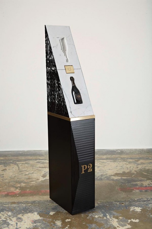
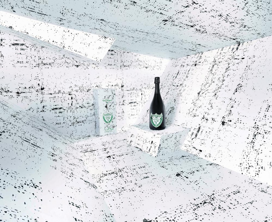
Riedel and the champagne house joined forces to celebrate the love of transformation they share. Riedel took the initial letters of Dom Pérignon and continually superimposed them on each other until they became almost illegible, and the winemaker put the result on the label of the Dom Pérignon P2 bottle and the box the bottle comes in.
“I love working on transformation expressed through different techniques, such as deconstruction or superposition,” Riedel says. Look more closely and you’ll notice HTML text peeking through the jumble of letters. The HTML text is taken from a website selling fine arts supplies. By using the text, Riedel subverts its original meaning and turns it into an art material, revealing facets of the letters and words that were previously unappreciated, and which invite new interpretations.
“The sense of my creations goes beyond the meaning of the words that are part of them, but I find it interesting how these words still influence the interpretations,” Riedel says. “The pattern I have created for Dom Pérignon is made of the letters D and P, obviously standing for the name of the champagne house. And even if the pattern completely transforms the letters through hundreds of layers, it preserves the link to Dom Pérignon.”
