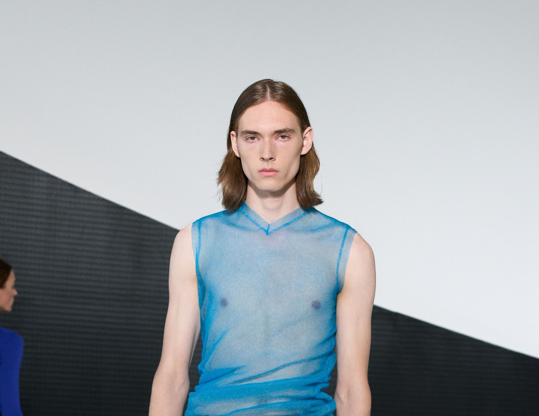
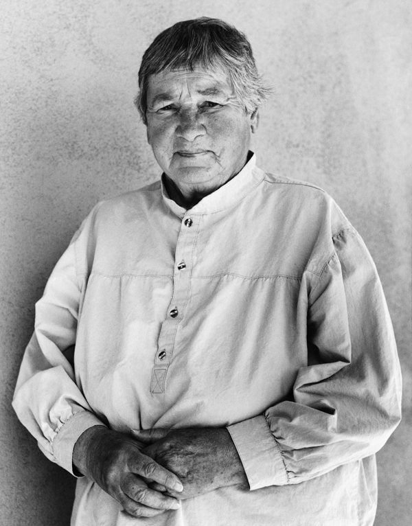
Cos has infiltrated the fashion world in much the same way as artist Agnes Martin haunts the world of art: they’re there, but never in your face. First we marvel at their seeming simplicity, then become engaged by their depth.
Such synergy was clear when the London-based, Swedish-owned fashion retailer backed an exhibition of the late artist’s work at the Solomon R. Guggenheim Museum in New York. Two months later the Royal Ontario Museum in Canada acquired three pieces of menswear from a 12-piece collection designed by COS to accompany the exhibition.
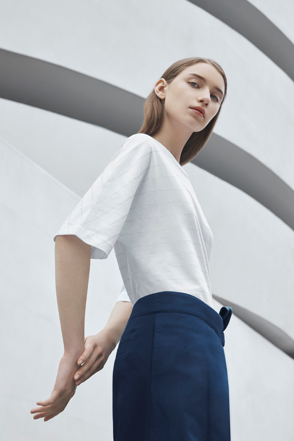
The support given to the Martin exhibition was COS at its COS-iest. The retailer used the work of the Canadian-born artist to document modern trends in fashion marketing, and the fusion of art and fashion. The collection was derived from Martin’s minimalist painting and the type of clothes she worked in. She wore jumpers, trousers, skirts, shirts and tops. The collection consists of clothes in the same sort of subtle prints Martin was known for. The silhouettes, though updated, are classic.
“The incredible richness and tactility of her work has always inspired our fabrics and designs,” says COS creative director Karin Gustafsson. “Her use of subtle colour, and dedication to her technique and style, elevate apparently simple lines and grids to something extraordinary.”
Once you start Gustafsson on the painter’s influence on COS, there’s no stopping her. “I think we’ve looked into her work many, many times for inspiration. We really, really are fans of her work,” she says.
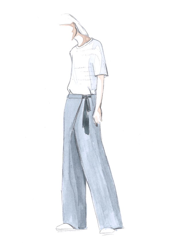
COS gave the Canadian museum a pair of belted, straight-leg trousers; a tunic shirt in cotton with a printed check; and a linen coat patterned in grey and black. The clothes donated represent an intersection of fashion, art and textiles. They will be displayed next to furnishing textiles and fashions designed by Raoul Dufy, Pablo Picasso and Salvador Dali.
“Agnes Martin and the Guggenheim is one of the biggest collaborations we’ve done so far,” says Gustafsson. “We do this because we see that our customers also share the same values. And it feels, for us, like a really natural way to give back, but also share with them what we get inspired by. Collaborations like this allow us to communicate with our customers.”
Gustafsson says COS approached the Agnes Martin Foundation, which owns much of the artist’s work. “We then brought with us some fabric works. We translated her art – with an atmosphere of her art, really – into fabrics. We don’t really take a literal approach when we look into inspiration. We tend to go for the spirit, and the feel of it. The meeting went well, and we worked on a collection. We explored many different types of surfaces, fabric manipulations.”
COS is celebrating its 10th anniversary with a capsule collection, called COS 10, comprising 10 pieces of clothing for men, women or children. The range is inspired by the work of small, cutting-edge designers of furniture such as Mun of South Korea and Studio Lo of France. Its features include geometric shapes, and shades of sand and white. “We want to offer something that will last for a long time,” Gustafsson says.
COS did a deal with the Serpentine Galleries in London to create a bag inspired by the 15th Serpentine Pavilion, designed by José Selgas and Lucía Cano, and a pair of shoes inspired by the 14th Serpentine Pavilion, designed by Smiljan Radic.
“Art and design play such an important part in our work,” Gustafsson says. “The brand selects partnerships based on shared interests, aesthetics, and ideals.” The retailer also likes to bet on the underdog. “COS takes a great interest in supporting emerging studios and individuals,” she says.
Godfather of art and curator of the Serpentine Galleries , Hans-Ulrich Obrist, has become a big fan of the brand. “COS is amazing and very accessible and democratic,” he says. “They are very much what Edouard Glissant, the great philosopher and poet from Martinique, called mondiality – a form of being global without alienating local people or a local dimension.”
The retailer has been creating installations for the Salone del Mobile in Milan every year since 2012. It collaborated on these installations with Japanese architect Sou Fujimoto last year, with US design studio Snarkitecture the year before, and with Japanese design studio Nendo the year before that. This year COS is collaborating with Studio Swine, consisting of London designers Azusa Murakami and Alexander Groves, both graduates of the Royal College of Art.
The designers are putting up what Murakami calls a “focal blossoming sculpture” which will stimulate the senses and reflect the special lightness of COS collections. The designer says that last year was a year full of changes and crisis, so she and Groves, her husband, wish to create an installation that can offer a moment of contemplation. “The inspiration for the installation was nature and the changing of the seasons,” Murakami says. “For us, this idea has such universal beauty. We aim to create a democratic experience which brings people together.”
Says Gustafsson: “Our many common values – a focus on timelessness over trend, functionality within beauty, and the exploration of materials – mean that working together is a very natural fit. I’m really looking forward to seeing the concept come to life in Milan.” The installation will be on show from April 4 to April 9 at the Cinema Arti in Via Pietro Mascagni in Milan.
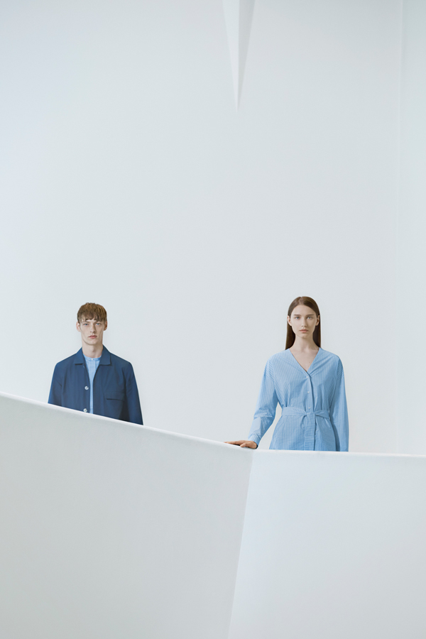
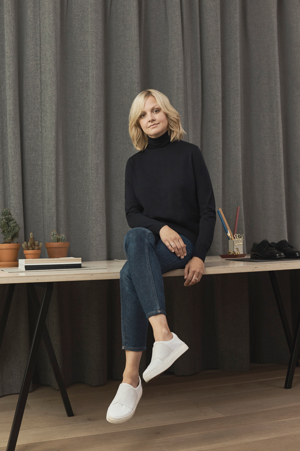
For many people, COS is the more affordable alternative to a brand such as Prada. At a deeper level, the design aesthetic of the brand seems to be a perfect mixture of Scandinavian and Japanese influences. Gustafsson is a graduate of the Royal College of Art. COS head of menswear design Martin Andersson studied at Central Saint Martins.
Gustafsson says the brand focuses on clever design and functionality, and that its aesthetic is understated and to-the-point. “That is very much what we think about, what we value and what we make sure to capture in our collection,” she says.


